
Designing order management software that works.
Our human centered design process.
Collaborators
Dinah Coops: Visual design
Tara Devlin: UX design/research
Engineering team management
Product manager
Challenge.
Improve usability and update design of existing telecom order troubleshooting software while adapting for a new international market.
Process.
Research and testing. The UX designer conducted expert interviews, developed a key persona, journey map, and multiple rounds of wireframes. Flow and usability was validated with user testing in incremental steps.
Visual design. Sketching, design iterations, utilization and adaptation of UI design library. Created dashboard, iconography and color themes.
Outcome.
Final UI and specifications for order management software answering key design objectives.
This software was not built because of resourcing constraints, but it did influence later projects with its user centered process.
Who is the customer and who is the user?

Key findings learned from the research.
Discoverability.
Potential problems were not easy to monitor from a visual hierarchy standpoint.
Inefficiency.
The system was not efficient for resolving multiple similar problems.
Ineffective visuals.
Difficult to use, unwieldy gantt charts and visualize problems within individual orders.
Design recommendations.
Dashboard.
Switch to a dashboard format so that problematic trends can be seen at a glance.
Bulk actions.
Create a system for viewing and correcting the same problems across multiple orders.
Info visualizations.
Develop visualizations that have flexible parameters and are easy to understand.
New user flow.

UI
A look at the dashboard visual design process.

1. Legacy software 2. Wireframe by the UX designer 3. Sketching to work through the details 4. The final dashboard
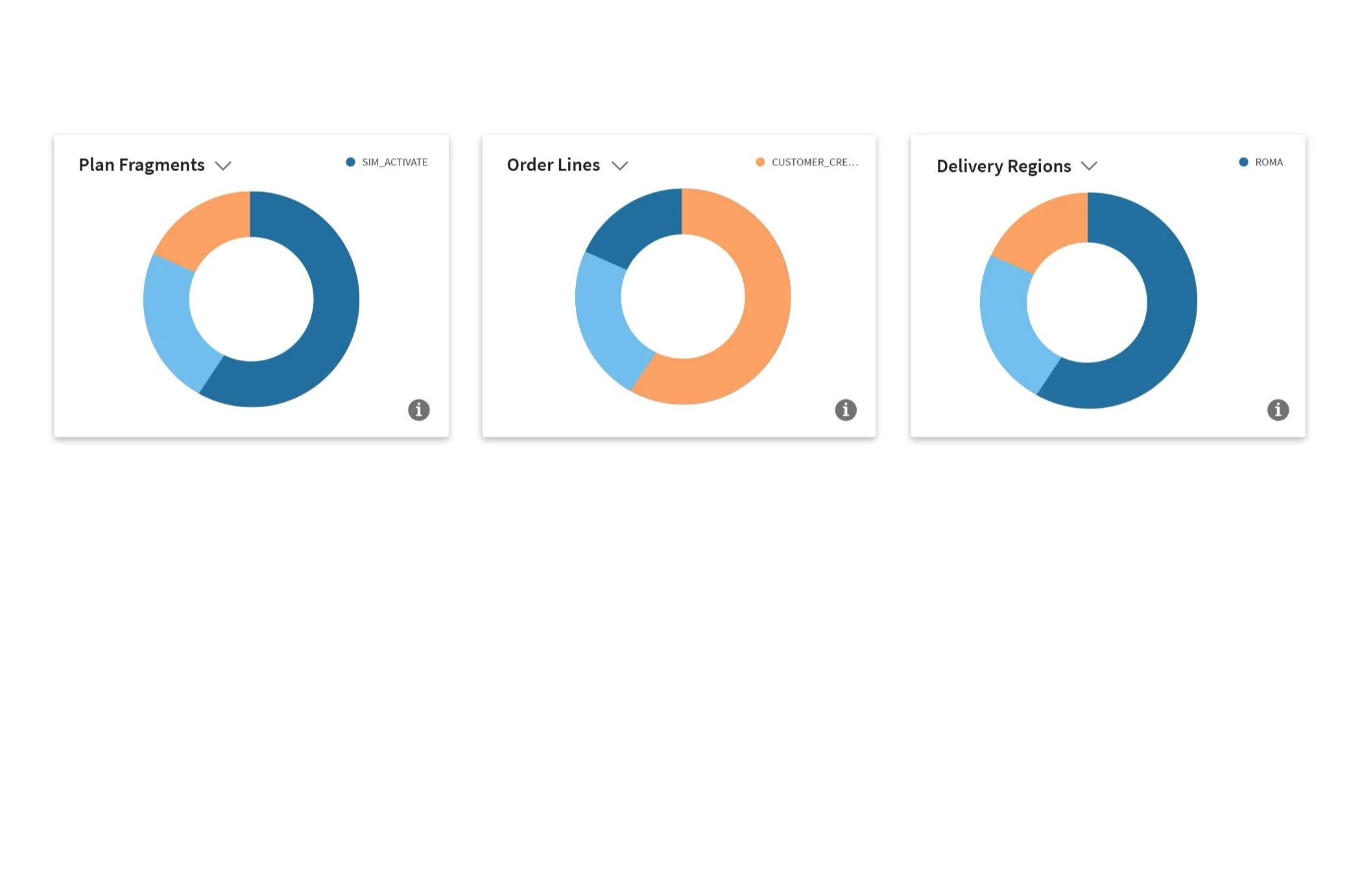
A flexible dashboard.
Controlled by the user.
Visualizations of the data
Variable time frames
Robust search
A bulk action system.
Order finder

Aggregated suspected problem orders

Deep dive on individual orders


Info Visualizations.
Timeline above, dependencies to the left and above.
Timeline and dependencies. The timeline shows expected and actual timeframes for processes. Used for troubleshooting purposes, the user decides what time increments to visualize. Dependency charts can then further pinpoint problems.
Reflection
Learnings.
It was very satisfying to complete a complex and detailed software design such as this, however, since this was intended for future implementation, I missed the rigor and input of regular standups.
Nonetheless, I was pleased to hear that our work impacted the process for future projects, even though the funding and bandwidth were not available for the company to build this.
Example screen with specifications.