A human centered design
concept for civic engagement.
Civic Stickies used an end to end human centered design process to exploring civic
engagement that leads to voting amongst millennials.
Our human centered design process.
Collaborators
Dinah Coops: Design and RA
Hayley Bierbaum: User research
Stefanie Funtsch: Design and RA
Bermet Jamankulova: PM
Challenge.
To identify, research, design and test a UX solution in a significant social problem space
We identified low voter turnout of millennials as our challenge
Process.
Research. Secondary research on voting behaviors; competitive analysis of what’s in this space now; (N=74) quant survey; (N=8) semi- structured interviews; analyzation of results; persona development
Ideation & prototype. Design principles development; brainstorming and affinity diagramming; low res prototypes; iterations
Testing. User testing and focus group
Outcome.
Design concept. An immersive application that lets Millennials submit and explore civic issues in a fun, convenient, and community driven way.
Problem space from a 2017 perspective.
2014
Only 23% of Millennials (ages 18-34) vote in elections, which was a 10% decrease from 1978
2016
Millennials of voting-age and Baby Boomers each make up 31% of electorate
2018
Millennials are projected to exceed Baby Boomers as the majority electorate
Research methods.
Survey
74 respondents between ages 18 and 34
across the United States
Semi-structured interviews
8 individuals with varying voter behaviors
Secondary research
Competitive analysis
“You can read a bunch of stuff, but actually seeing candidates and hearing what they say or feel is really beneficial to form an opinion about how you vote.” P1
“The national elections feel more important, but local (issues) are really more important; because they have more impact on our day to day life.” P2
Top research findings.
Trustworthy information
to know who and what to vote for, why and when
Convenience
Connection
with candidates and issues
Impact
of their vote on outcomes and issues
Community
“If people are not exposed to issues [that other populations experience] they aren’t thinking about the issues.” P3
Main persona.
This is Olivia.
She is in the early stages of her career, and has a busy work and social life. She finds voting dry and cumbersome. But, when there are issues that are important to her like affordable housing and transportation, she finds herself wanting to get more involved.
Demographic
Urban millennial
Motivations
To feel connected to candidates and voter issues
Make a difference, create change
Make an informed decision and vote with confidence
Pain Points
Access to an appropriate amount of relevant and consumable information
Time
Distrust of information
Actions
Prioritizes voting
Only votes if informed

Ideation.
Design principles.
Transparent.
We provide information that represents different perspectives and verified sources of information.
Easy to understand.
We strive to give clarity and ease of understanding of complex concepts and ideas.
Collective.
Our design builds community amongst voters. We strive for human connections between people.
Engaging.
We create fun and compelling experiences. We make it easy and desirable to be a part of the voting process.
Convenient.
We fit into your routine, and we don’t make you conform to ours. We understand that people have busy schedules and limited time.
Ideas from my sketchbook.
Ideas included: Meet the candidates and see their future visions in VR | Public commenting about situations in people’s communities | Aggregation of issues and what’s coming up | Pizza, beer and politics | Voting reminders and tips

Real life inspiration.
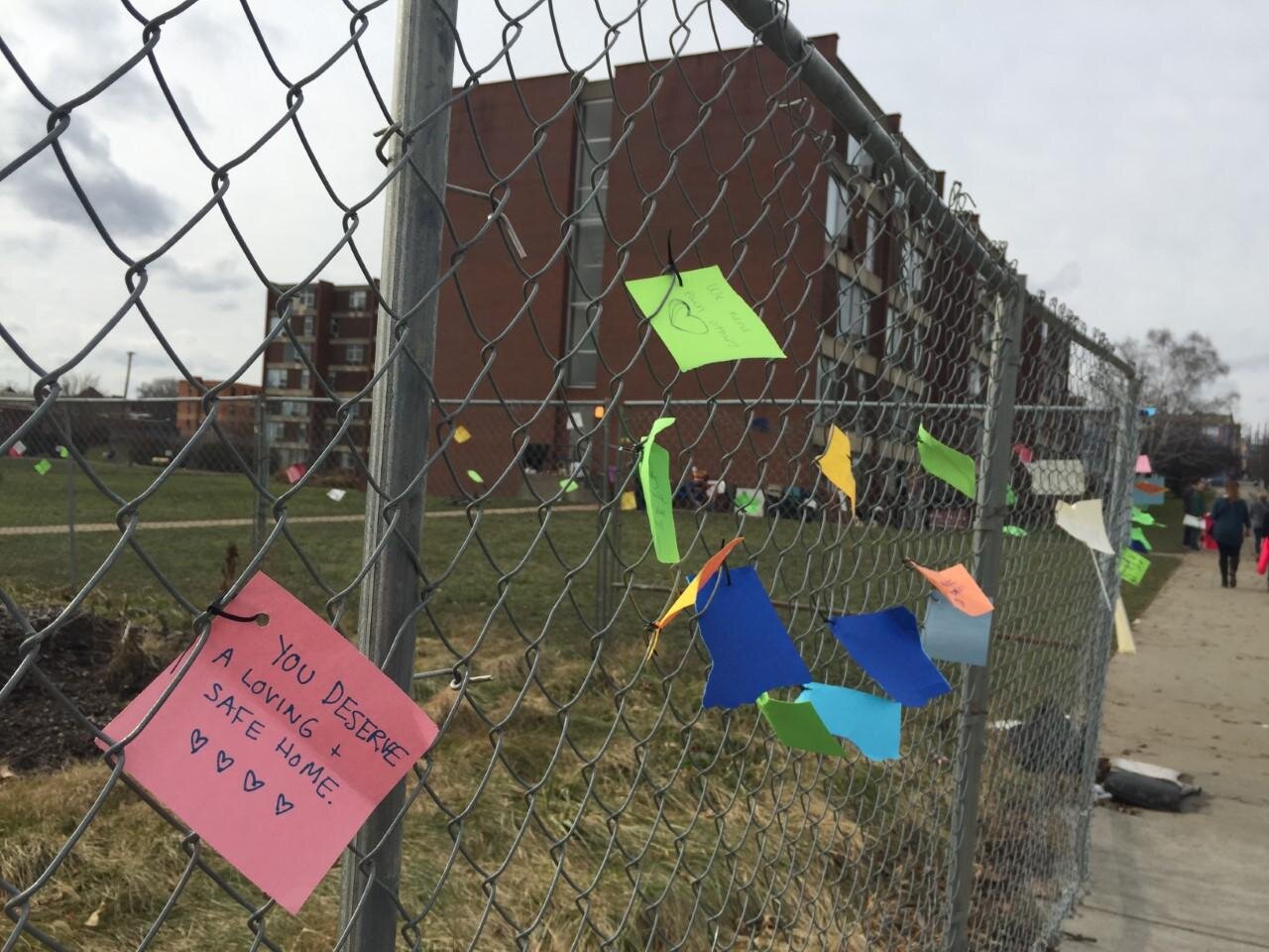
Sticky notes at Penn Plaza on Saturday, Jan. 21, 2017.
KATIE BLACKLEY / 90.5 WESA
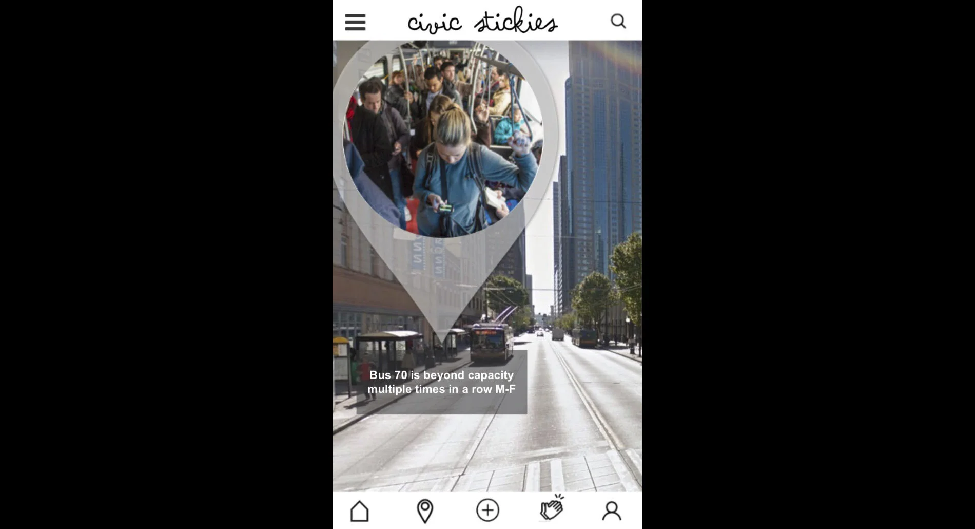
We landed on the idea of making a digital version of public commenting, an application that functions as an AR and social networking platform to create and amplify local awareness and connection with legislators.
Lo-fi prototype/app.
home page | new issue | individual issue | search by issue | AR view | search by location
Lof-fi prototype/interactive billboard.
In addition to the app, we tested the idea of interactive billboards that would be placed around the city to spark attention about different issues in the city and create the feeling of community. This would also help people learn about our app.
Iterations from user testing.
Home screen.
An example of how our home screen developed over time from an issue index to an immersive AR screen.
Candidate feedback.
Learning from our user findings we worked through ideas to show candidates and their opinions so that they’d have more accountability and to create a direct feedback loop with our users.

Design solution.
“Civic Stickies is an immersive application that lets Millennials submit and explore civic issues in a fun, convenient, and community driven way.”

Interactive
billboard.
App demo.
Looking forward.
Next steps.
Add in community interactions within the application
Address user trust and privacy concerns
Connect upvoted issues to realistic timelines and upcoming elections
Team reflection.
What worked:
Leveraging team strengths
Integrating conflicting user feedback
Managing scope in a rich problem space
To consider:
How does this platform work for issues that don’t have a physical space?
How could this platform be used to help breakdown systemic racism?


